
Most campaign numbers measure engagement, not lift
A World Cup brokerage promo needed two machines, one to run it every morning and one to judge whether it had worked. Both failed in ways that looked like success.

At Syfe I ran a brokerage promotion built around the World Cup, a branded landing page with raffle mechanics attached to trading activity, and it needed two machines rather than one, the first to run the promotion day to day, and the second to answer the question that arrived once it was over, which was whether the thing had actually worked. The second is the more interesting problem and I will come to it, but the first is where most of the actual work went, and it is the half that usually goes undescribed.
Running it
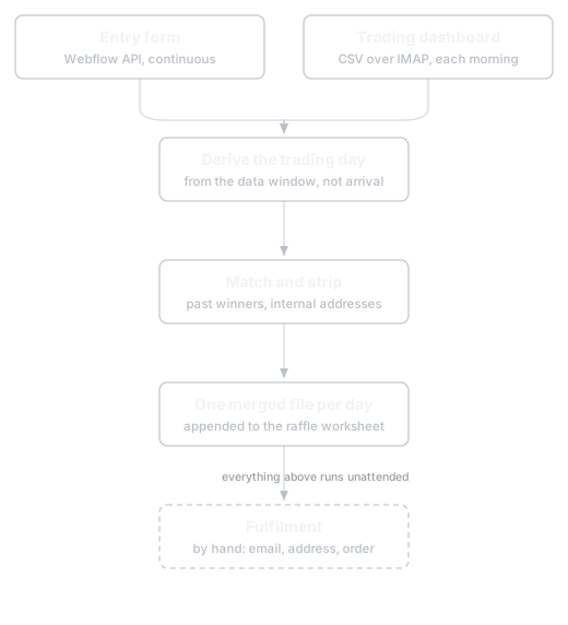
A daily promotion has a daily rhythm, and the rhythm is unforgiving. Entries arrive continuously through a form on the landing page, while the trading data arrives just once each morning as a CSV attached to an automated email, covering the previous trading day. Those two things have to be matched, the day's qualifying opt-ins appended to the raffle worksheet, a winner drawn, a voucher issued, and that winner published back onto the live site so the campaign page shows something current.
Doing that by hand, every trading day, for the length of the campaign, is precisely the kind of small recurring obligation that gets dropped. Not dramatically, just quietly, on the morning something more urgent happens, and then the public page is stale and somebody notices.
So it became a scheduled job on a server, firing at quarter past nine each morning, Tuesday through Saturday. It pulls the form submissions through the Webflow API, fetches the morning's dashboard CSV over IMAP, derives which trading day the data actually covers from the window in the file rather than from the date it arrived, files it into the right folder in a way that is safe to run twice, produces the day's opt-in list, and appends it to the worksheet. Past winners and internal test addresses are stripped before anything is written out, so nobody who has already won gets contacted again.
Where it runs was a deliberate choice rather than a convenience, because opt-in emails are customer personal data and the first version of this ran as a scheduled task on a workstation. Moving it onto a network-isolated server meant that personal data never transits a public cloud service at any point in the pipeline, and that the machine doing the handling is one with a defined boundary around it. That is the sort of decision that costs an afternoon and saves a conversation you would much rather not have.
The winner side publishes back to the site's CMS, creating the winner entry, linking it to the correct raffle day matched by date rather than by day number, and pushing both live. It refuses to write anything until it has printed the full plan and been told to proceed, it has a dry-run mode, and running it twice does not create a duplicate. Names get normalised on the way through, because the source data delivers them in wildly inconsistent capitalisation, and very long names get shortened for the public card while the full version stays in the fulfilment file.
Fulfilment itself stayed manual, and that was rather obviously the right call, since it meant emailing the winner, collecting a delivery address, and placing the order on the supplier's store page, which is ordinary operations work that happens at most once a day and involves confirming details with a real person. Automating it would have saved almost no time and introduced a genuinely expensive failure, since getting a stranger's delivery address wrong is not a bug you can quietly patch. The pattern is the same one I keep arriving at, which is that you automate the derivation and leave the irreversible step to a human.
The three bugs worth remembering
The pull that quietly capped.
The entry count coming back from the form API settled on a suspiciously round number while the form itself had rather more submissions than that. Webflow, it turns out, splits a single form element into separate form IDs, one for each page the form has been published on, and the site-level endpoint I was filtering against silently returns only some of them. The fix was to enumerate every form sharing that element and query each one directly. The lesson I actually took from it is smaller and more useful, which is that a round number is a smell, and any count that lands on one deserves a second look before you trust it.
The duplicate that broke the day.
One morning the pipeline simply stopped producing folders. A second internal sender had begun emailing the same subject line a minute or two after the real one, carrying no CSV at all, and the fetcher was taking the most recent same-day match. So it picked the empty duplicate, found nothing to work with, and exited before it ever created the day's folder. The previous day had survived only because the job happened to run before the duplicate landed, which is not a safety margin so much as luck. The fix was to select on whether the email actually carries a CSV rather than on who appears to have sent it, since a display name is a flimsy thing to build on.
The off-by-one at the end.
The campaign end date was guarded in the code so the job would stop cleanly, and I set that guard to the last day of the promotion, which was wrong. Each day's data lands the morning after the trading it describes, so stopping on the final trading day meant never processing it. One day out, entirely invisible until you think it through.
There was also a fourth thing, less a bug than a discipline. The date attached to every entry is the qualifying trading day, never the day the draw was executed, and never the date column in the export, which is stamped at export time and can quietly carry the day the file was pulled instead. Get that wrong and the same entry appears under different dates on different runs.
What got deleted
The first version did rather more, there were two separate output files, one for people who had traded and one to nudge people who had not, plus name columns, plus a running campaign-wide consolidated file. All of it defensible, none of it necessary. It collapsed to a single merged file per day carrying only what the next step actually consumes, and the pipeline got more reliable in direct proportion to how much of it I removed.
Measuring it
Which brings me to the second machine, and the question of whether any of it worked.
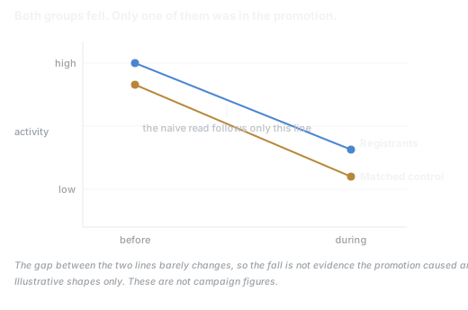
The naive version goes rather like this, you take everyone who registered for the promo, you look at what they did during the promo window, you compare it to what they were doing before, and if the line goes up you declare success. It is quick, it is intuitive, and every campaign report I have ever been shown does some version of it.
The problem is who registers, because people who opt into a trading promotion are, almost by definition, people who were already inclined to trade, and quite often people who were already about to trade more. So a rising line tells you that engaged customers were engaged, which is not nothing, but it is an engagement read rather than a lift read, and only one of those answers the question the business is actually asking. If you present the first while everyone in the room hears the second, you have not lied exactly, but you have let something untrue take hold, and it will be repeated back to you in a planning meeting six months later.
Getting to lift means having something to compare against, so I built a matched control. Every registrant was paired one to one with a non-registrant, without replacement, matched within their tier on pre-period behaviour, and the comparison then becomes a difference in differences rather than a before and after. What changed for the treated group, minus what changed for people who looked just like them but never entered. Whatever moved both groups equally, seasonality, market conditions, a good month, drops out of the answer, and what remains is closer to something the promotion can take credit for.
The moment that justified the entire exercise came from the deposits.
Looking at registrants alone, their deposit rate went down over the promo window, while the platform's overall deposit rate went up. There is a very tidy and very wrong story available there, which is that the promotion cannibalised deposits, pulled attention toward trading and away from funding, and did active harm. I can imagine that conclusion being written up, believed, and used to argue against ever running anything similar again.
What the matched control showed is that the registrants had come into the window on an unusually hot baseline, and what looked like the promotion suppressing behaviour was a group regressing toward its own mean. The control group, matched on that same hot pre-period, moved the same way. Without something to compare against I would have had a plausible, well-presented, confidently-charted finding that was the opposite of the truth, and nothing in the raw numbers would have flagged it.
The second thing that nearly went wrong was concentration, because financial behaviour is rather brutally top-heavy, a handful of clients account for a wildly disproportionate share of traded value, and any headline built on value is therefore hostage to a few people's individual decisions. So I whale-stripped every headline, symmetrically, dropping the top few by pre-period activity and the top few by post-period activity and taking the union of both, at several thresholds, then reporting the result both with those clients kept and with them removed.
That test found something worth knowing, which is that the value-based results were fragile enough that a single client on the control side, one person having an unusual month, was enough to flip the sign of the stripped comparison. The trade-count comparison, on the other hand, barely moved no matter who was removed, because counts are far harder for one person to distort than value is. So counts became the headline and value became supporting detail, which is the reverse of how these reports usually get written, since value is the number that sounds impressive.
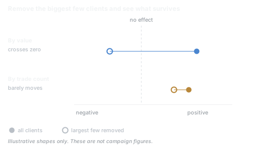
The rule I took from that is to lead with whichever metric survives having its biggest contributors removed. If your headline changes character when one client leaves the dataset, it was never a finding about the campaign, it was a finding about that client.
Everything else was rather less interesting and mattered just as much, starting with definitions, which have to be pinned down before the analysis rather than after it, because afterwards you will choose the flattering one without especially noticing that you did. "Percentage of registrants who traded" turned out to have three entirely defensible definitions depending on which window you counted over, and they were not close to each other. Any of the three was arguable in isolation, but mixing them across charts in the same report would have been indefensible, so each chart states its definition and footnotes the others.
Windows of different lengths have to be compared as per-day rates rather than totals, which sounds too obvious to write down until you notice a baseline period several times longer than the promo window sitting in the same table as it. Delivered data needs validating before it is analysed rather than after, and one file arrived with a name promising thousands of records and contained a handful, which is the sort of thing that produces a confidently wrong chart if nobody checks, so pick files by row count and not by filename.
And the whole thing runs as a pipeline rather than a spreadsheet. Source files go in, an analysis script produces a results file, a report script renders that into the document, and no figure anywhere in the output is ever typed by hand. Integrity checks run on every pass, reconciling the treated and comparison groups against platform-wide totals and verifying that funnel stages are genuine subsets of one another, and the report refuses to build if any of them fail. This is less about elegance than about the fact that I did not want to be the reason a number was wrong, and a person editing a figure in a document late at night is exactly how that happens.
Why bother
None of the analysis is sophisticated, and I want to be clear that I am not claiming otherwise. Matched controls and difference in differences are old, well-understood tools, and any economist would find the above unremarkable. What is uncommon is applying them to a marketing campaign at all, because campaign reporting is rarely held to that standard, and the incentives all point toward whichever number reads best in a deck.
Both halves of this project came down to the same discipline, and I don't think that is a coincidence. The pipeline that ran the promotion failed in ways that looked like success, an empty duplicate email that produced no error, a capped API response that returned a perfectly plausible number. The analysis could have failed the same way, with a confident chart showing the opposite of what happened. In each case the output gave no indication that anything was wrong.
That is the same problem I spend most of my time on now with AI tooling, and the answer has not changed. You do not fix it by being cleverer. You fix it by pinning your definitions before you look, by building something to compare against, by validating what arrives instead of trusting it, and by refusing to ship the result until it has survived the tests you would want a sceptic to run.
Nathan Wong is in Singapore, building AI automation and low-code tooling. Portfolio